Updated: 06/08/2026
Following on from our previous Post regarding colour, the next obvious question (to us anyway!) is does colour make a difference on your website? We could also ask does colour actually affect conversions – do we get more sales or enquiries if we choose certain colours?
The “best” colour for websites has been debated over recent years and even though there is no hard and fast rule as we’re all affected by colour differently, there are some points to bear in mind.
 So, if it’s definitely true that there is no single best colour for conversions on your website, what does work?
The psychological principle known as the Isolation Effect states that an item that “stands out like a sore thumb” is more likely to be remembered. Research clearly shows that participants are able to recognise and recall an item far better (be it text or an image) when it blatantly sticks out from its surroundings.
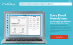
On the site page above, the sign-up button stands out because it’s like a red “island” in a sea of blue. So it’s NOT the colour red that gets a response, it’s the fact that the red button stands out from the rest of that page.
Another way to think of this is to utilise background, base and accent colours. What we do is “train” visitors that the red button in our example (but it could be green, blue, yellow, purple, or whatever), is a cue to take action. So when visitors see something in red they “know” what to do!
So, does a big red button work? Have a look at the two sites below – which do you think had the best conversions?
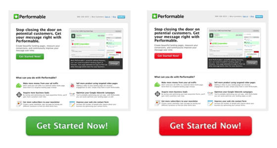
The only real difference between these two site pages are the button change from green to red, but the change from green to red boosted conversions by 21%. Does that mean that red holds some sort of magic power to get people to take action?
If you look closer at the image, both pages are stylised in a pale green palette, which means the green call to action button blends into the surroundings. On the other page, the red button is a stark visual contrast, resulting in a boost by 21%, but that button could have been any stand-out colour!
Remember, “What stands out gets remembered, what blends in gets ignored.”
So it’s NOT the big red button at all! It’s the overall colour theme of your site complemented by good, bright, stand-out colours for your call to action cues. So anything like “buy now” or “free catalogue” should stand out. Visitors to your site get “trained” when they visit your landing page by seeing that the stand-out colour means TAKE ACTION, then when the call to action is used on other pages they instinctively know that the colour means do something; CLICK HERE!

Right Click Digital
1 Bridge Chambers
Barnstaple
Devon
EX31 1HB
www.rightclickdigital.co.uk
Tel: 01271 523 586